I'll be presenting this piece to several of my animation colleagues at DreamWorks to get their intense feedback, can't wait to hear their input. Thanks to everyone who helped contribute to this piece. On to the next!
Showing posts with label Analyzation. Show all posts
Showing posts with label Analyzation. Show all posts
Tuesday, June 5, 2012
11 Second Club May 2012 Competition Entry
May has been a very busy month for me, but especially busy since I took another swing at the 11 Second Club Animation Competition.
This month was a great energy-building two-person acting clip from
Rebel Without a Cause. I got lots of great feedback and help along the
way, and managed to hit 6th place out of 245 entries! My highest rating yet!
I'll be presenting this piece to several of my animation colleagues at DreamWorks to get their intense feedback, can't wait to hear their input. Thanks to everyone who helped contribute to this piece. On to the next!
I'll be presenting this piece to several of my animation colleagues at DreamWorks to get their intense feedback, can't wait to hear their input. Thanks to everyone who helped contribute to this piece. On to the next!
Monday, April 2, 2012
I'm a Demon
Over the last few weeks I decided to animate a small bit of character animation in free time at home. I watch Tim & Eric Awesome Show Great Job pretty regularly, and possibly my favorite guest on the show is Will Forte and his various high-strung characters. He has such interesting body language and his facial performances are so unique that I wanted to do a close study of one of my (and every other T&E fans) favorite moments in the series: the Lazy Horse Mattress nightmare "I'm a Demon" moment.
For those unfamiliar with the referenced moment, here is the segment from which this clip is inspired by:
Anyhow, was fun study. On to the next learning project.
For those unfamiliar with the referenced moment, here is the segment from which this clip is inspired by:
Anyhow, was fun study. On to the next learning project.
Thursday, May 20, 2010
LOST: DIY Titles
Namaste, LOST watchers. The final episode airs this Sunday, and soon we will have to bid Aloha to our favorite headache-inducing show of questions and no answers. Before this whole thing comes to The End, however, there is one mysterious visual element worth discussing that I find more confusing than the island itself. This:
 The LOST opening titles, and their simplicity. Now, there is certainly something to be said about the minimalist quality of the titles being a fitting intro to a show whose hook is all about mystery, and often completely devoid of answers. It provides little visual information, giving us nothing to read into, and further just lets the viewer fill in the many blanks that the show has created over time. The rudimentary nature of the titles I don't have a problem with, but the rudimentary execution is what is boggling. The titles are just the word "LOST" rendered dimensionally, tumbling towards us in space through a very tight focal plane, meaning it appears out of focus as it approaches, and for a brief second comes into view before going soft again. Yet in this moment, we catch a glimpse of a horribly aliased, confusingly shaded amateur-grade graphic complete with artifacted edges. Most viewers probably don't even notice, but there is no doubt a large enough population of baffled fans, enough to prompt internet commentary such as this:
 Honestly, how does a show that has become the most popular serial series on television have a title that looks like it was the result of some student graphics class tutorial. A few ideas come to mind, but my primary theory is the fact that J.J Abrams has a history of giving a personal DIY touch to the titles of his shows. Before LOST, Abrams had created two other series, Felicity and Alias, both of which he decided to compose the title theme music himself, and in both cases it stuck straight through until the series completion. LOST is no exception, Abrams having composed the title theme again which remains the same today. It's possible that he thought it might be fun to go one step farther in this case and actually design and animate the opening graphics to accompany his music.
It's also possible that Abrams has little experience with graphics software, or was struggling to achieve the appropriate look he wanted. If the 3D titles were done in a comp software with a non-native plug-in of some sort, Abrams probably was attempting to tweak the raw output of the extension, to get something closer to his vision. However, the wrong mix of sharpening, minimize/maximize operations, and ramping blur animation will result in edge-artifacting very similar to the moment we see in the titles. The aliasing of the words, the odd soft-edges of the letter shading, and of course the artifacts themselves, make me think this was likely the case. Of course it is also possible that they just hired a lowest-bidding title company to slam out a quick rendition of the titles for approval, and somehow those made it to air, but for a pilot that cost between 10 and 14 million to make, it seems likely they would spring the extra cash to get a quality title.
The frustrating LOST title is likely the consequence of a tradition that Abrams, and perhaps many series creators and show runners, has adhered to. I'm sure there is a bit of fun and excitement for any series creator or creative head to place their personal mark on their baby before sending it out into the world, even if it means the sacrifice of quality and polish. His tradition continues in Fringe, to which he once again composed the title theme. Yet maybe after his LOST title debacle, he's decided to get out of the pro-hobbyist graphic design business.
UPDATE: Art of the title sequence has an article about this subject, and confirms that it was indeed made by Abrams himself on a laptop and after effects: http://www.artofthetitle.com/2008/02/29/lost/
Saturday, September 6, 2008
The Journey Towards Illustration Greatness: An Observation
Part of the experience of being an artist is constantly being motivated to improve and aspiring to expand your abilities and craftsmanship. I personally feel like I didn't really start to improve as an illustrator until I entered Graduate School and was able to not just practice my skills under incredible instruction, but also have the added bonus of being in an environment now saturated with fellow artists, all with different styles and skill levels.
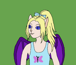 We've all been here before. This is the phase when the artist will be interested in illustration, and making valiant efforts to render the images in their mind, but lack the knowledge of anatomy, composition, silhouette, and directionality, let alone the ability to push the forms into 3D space. The result then, is work that generally comes out flat, constricted, and generally unappealing. Though, in the artists defense, they are making a valiant effort to improve. Or even if they aren't, they are at the very least putting in some good mileage towards improvement though experience.
Stage 2: Good Yet Boring
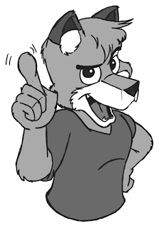 At this phase, the artist has now become instructed in the ways of form, composition, anatomy, and their illustrations are now starting to resemble the shapes and images they are attempting to communicate. The problem here is, the illustrations in this phase are usually rather stale and end up looking the same. They may be well-constructed, but the artist is still roaming around within their comfort-zone, and are focusing mostly on the technical and academia aspects of constructing the image, rather than variation in style or experimentation in different ways to communicate visual ideas. In short, the illustrations become good, but not particularly interesting.
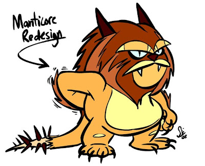
Stage 3: Dynamic and visually interesting
Finally at this phase, the artist has achieved a level of illustration prowess where issues like form, shape, and line are no longer technical concerns or problems for the artist. The focus at this level can now be purely on the communication, adapting whatever style or technique is necessary to properly render the image in a way that it will be most effective.
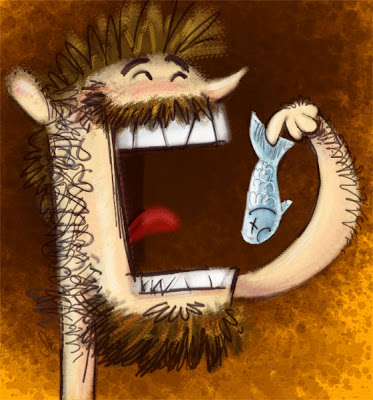
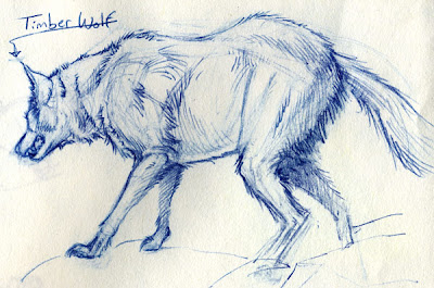 Usually at this stage, the artist's work consists of a large variety of styles and experimentation, ranging from the realistic (above) to cartoony (below)...
 ...to flat graphic and highly stylized.
 All of these stage-3 illustrations were done by the same artist. An extremely wide range of style but yet all with extreme confidence and deliberate line work, definitely a product of proper foundation and lots and lots of mileage/practice.
I think it's also worth mentioning that not everyone needs to go through these 3 stages in order to be a successful illustrator or artist. It's possible to jump straight from stage 1 to stage 3, and develop an interesting style that doesn't necessarily rely on form or shape to communicate ideas. Of course, by doing this the artist risks not only limiting their style to only one possible look, but also risks that style being appealing to only a very select audience.
 Squidbillies is a perfect example of what this kind of style might look like. Of course, the Squidbillies animation team can actually draw incredibly beautifully and just happened to design this particular look for the series (which I personally find very unappealing), but exemplifies that it is possible to make that jump without being a master draftsman; even though it might be very limiting for that artist in the future.
So, there are my idle thoughts on the journey towards becoming a great illustrator. I know I've certainly got a long way to go myself, and my next blog post will probably be yet another boring illustration from my amateur wrist, but I hope this article provided an interesting read, and in terms of how to get there, all I can do is quote my brilliant drawing instructor: "Draw! Draw, Draw, Draw!"
After being in the program for about two years, and pulling my draftsmanship out of the world of embarrassing and into somewhat-acceptable, it was then that I could see just how much further I really had to go, and started to observe a general pattern of stepping stones for really great illustration. I say observation only, since not only is this just my own thoughts and opinions, but also if I knew exactly how to become great, I would probably be closer to getting there myself. At any rate, I like to think of these phases as three general stages:
Stage 1: Static, Flat and Constrained
 We've all been here before. This is the phase when the artist will be interested in illustration, and making valiant efforts to render the images in their mind, but lack the knowledge of anatomy, composition, silhouette, and directionality, let alone the ability to push the forms into 3D space. The result then, is work that generally comes out flat, constricted, and generally unappealing. Though, in the artists defense, they are making a valiant effort to improve. Or even if they aren't, they are at the very least putting in some good mileage towards improvement though experience.
Stage 2: Good Yet Boring
 At this phase, the artist has now become instructed in the ways of form, composition, anatomy, and their illustrations are now starting to resemble the shapes and images they are attempting to communicate. The problem here is, the illustrations in this phase are usually rather stale and end up looking the same. They may be well-constructed, but the artist is still roaming around within their comfort-zone, and are focusing mostly on the technical and academia aspects of constructing the image, rather than variation in style or experimentation in different ways to communicate visual ideas. In short, the illustrations become good, but not particularly interesting.
Stage 3: Dynamic and visually interesting
Finally at this phase, the artist has achieved a level of illustration prowess where issues like form, shape, and line are no longer technical concerns or problems for the artist. The focus at this level can now be purely on the communication, adapting whatever style or technique is necessary to properly render the image in a way that it will be most effective.
 Usually at this stage, the artist's work consists of a large variety of styles and experimentation, ranging from the realistic (above) to cartoony (below)...
 ...to flat graphic and highly stylized.
 All of these stage-3 illustrations were done by the same artist. An extremely wide range of style but yet all with extreme confidence and deliberate line work, definitely a product of proper foundation and lots and lots of mileage/practice.
I think it's also worth mentioning that not everyone needs to go through these 3 stages in order to be a successful illustrator or artist. It's possible to jump straight from stage 1 to stage 3, and develop an interesting style that doesn't necessarily rely on form or shape to communicate ideas. Of course, by doing this the artist risks not only limiting their style to only one possible look, but also risks that style being appealing to only a very select audience.
 Squidbillies is a perfect example of what this kind of style might look like. Of course, the Squidbillies animation team can actually draw incredibly beautifully and just happened to design this particular look for the series (which I personally find very unappealing), but exemplifies that it is possible to make that jump without being a master draftsman; even though it might be very limiting for that artist in the future.
So, there are my idle thoughts on the journey towards becoming a great illustrator. I know I've certainly got a long way to go myself, and my next blog post will probably be yet another boring illustration from my amateur wrist, but I hope this article provided an interesting read, and in terms of how to get there, all I can do is quote my brilliant drawing instructor: "Draw! Draw, Draw, Draw!"
Subscribe to:
Posts (Atom)